ZERONE|Brand Identity Design
Moving away from the cluttered and fragmented visual language often seen in traditional mobile retailers, we aimed to elevate ZERONE into a cleaner, sharper, and more contemporary visual system while retaining clear industry recognition.
ZERONE is a telecommunications retailer with five locations across central Taiwan. With its founder recognized within the industry, the brand commissioned us to reshape its identity system in response to its next stage of growth and market positioning.
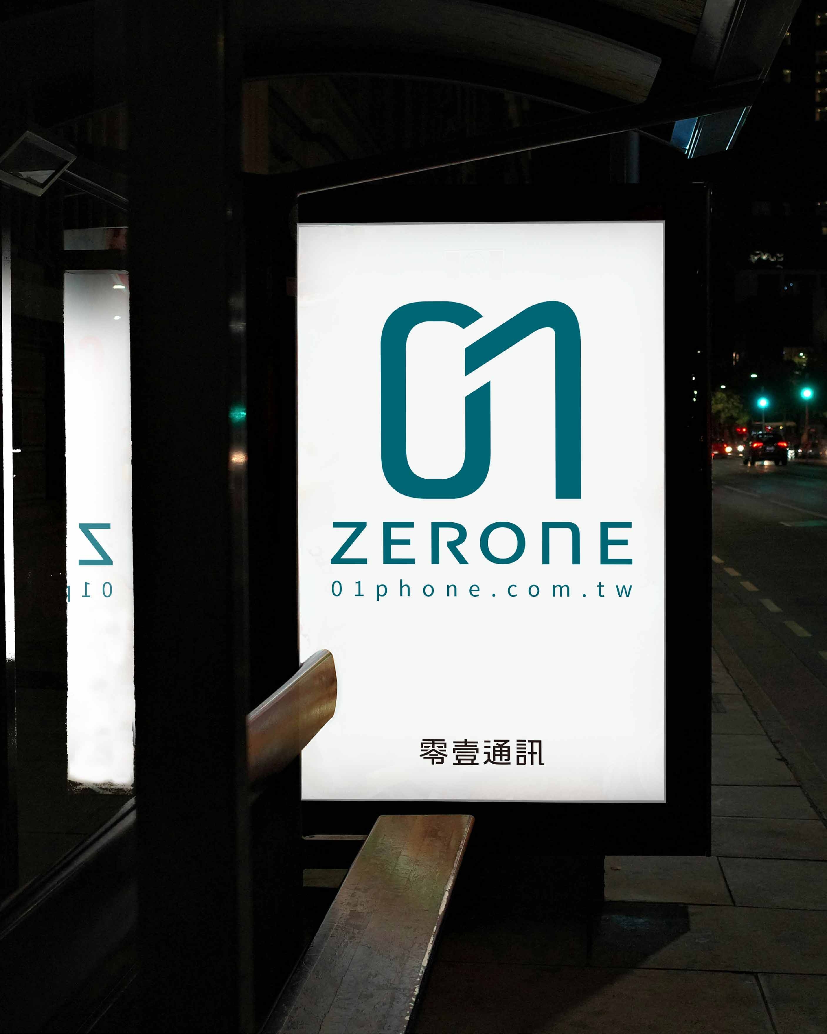
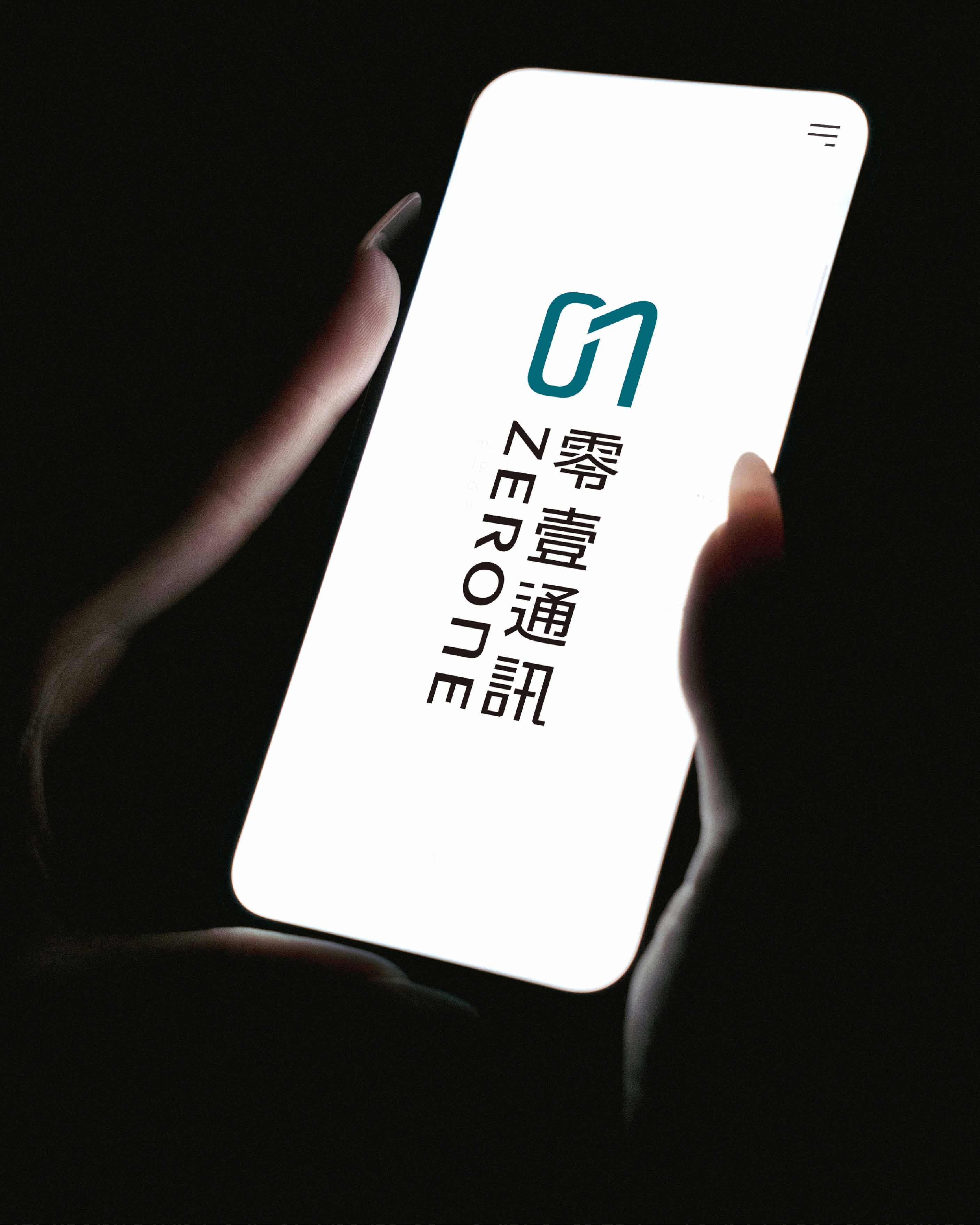
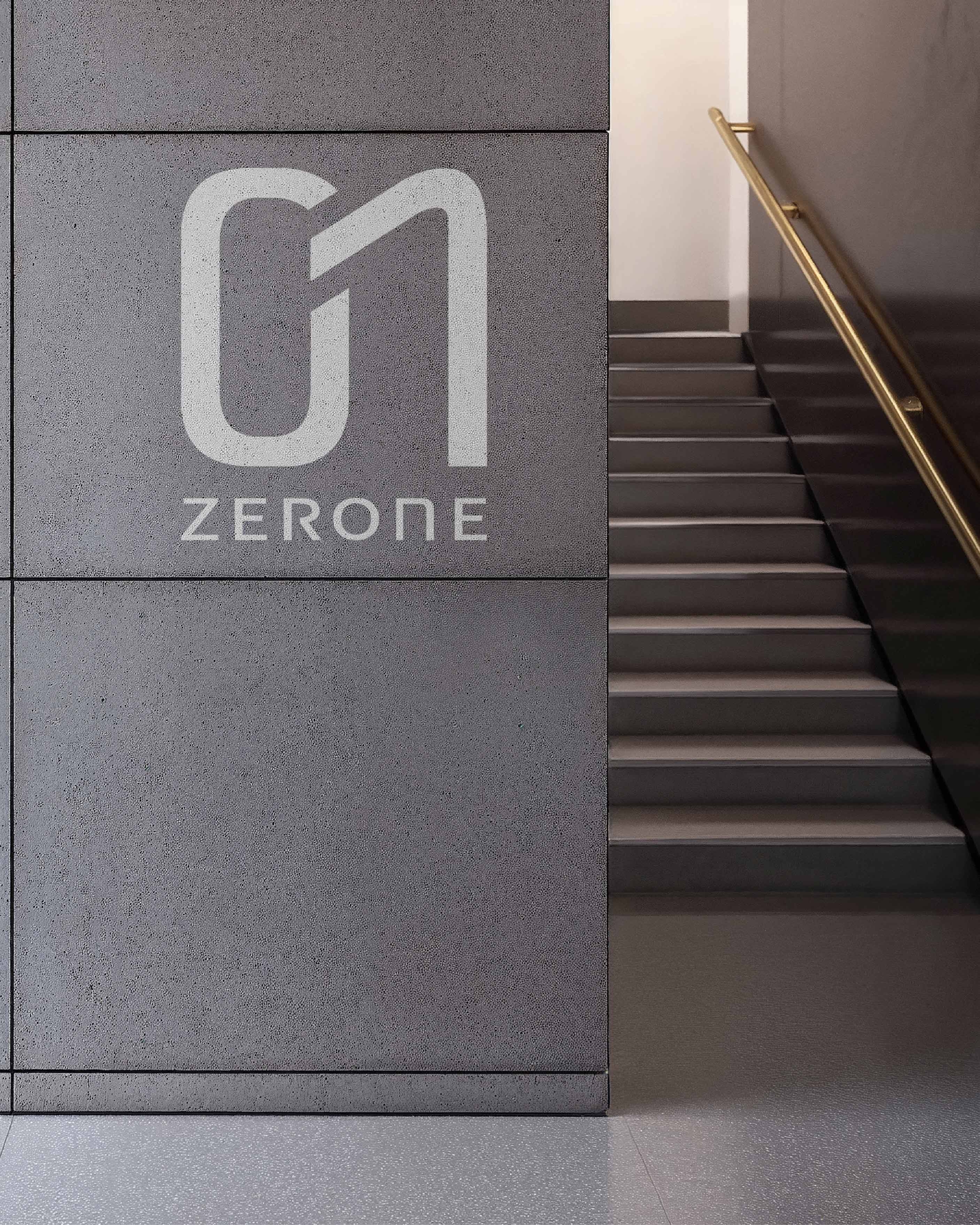
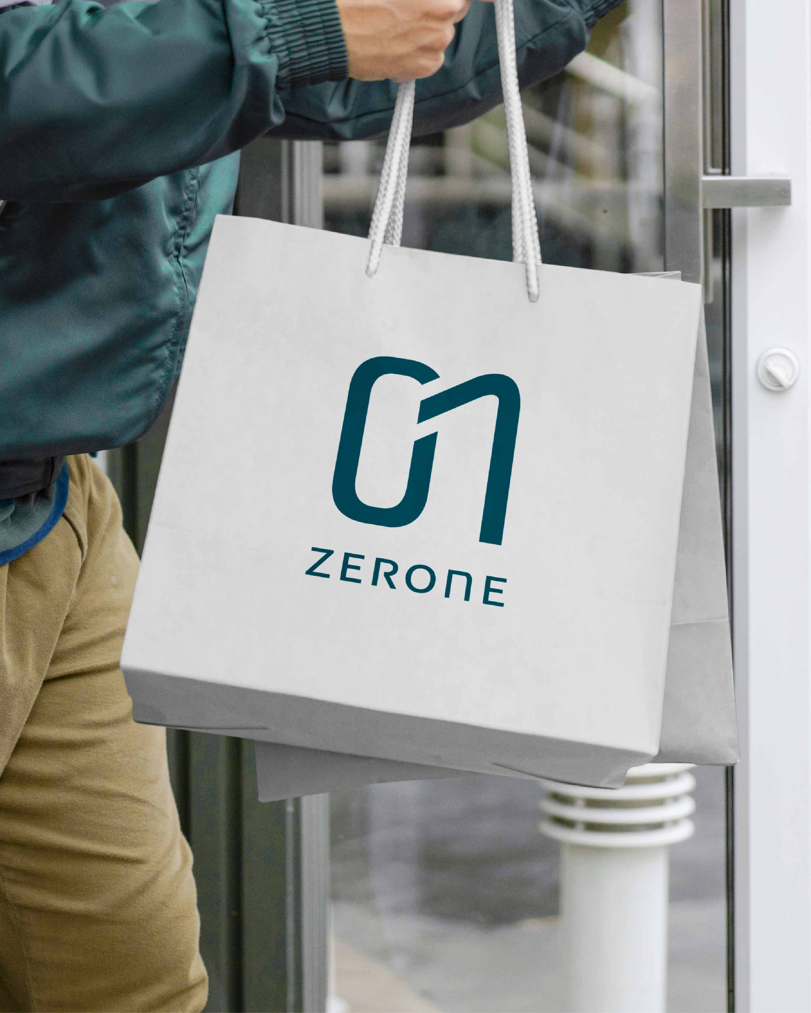
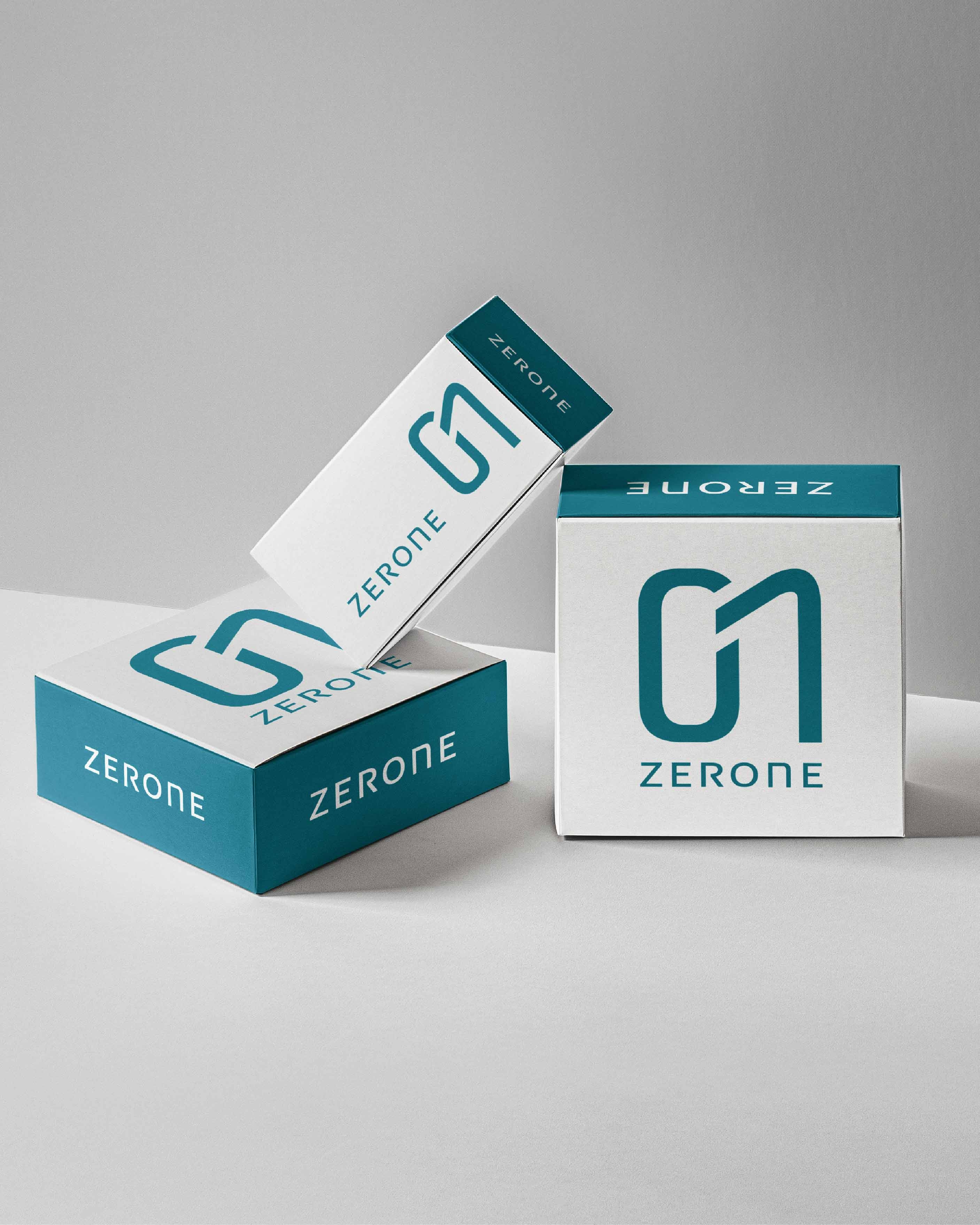
The primary mark is built around the core concept of “01,” paired with a newly developed English name, “ZERONE.” By merging “ZERO” and “ONE” into a single word, we transformed an intuitive brand name into a more distinctive and scalable brand language.
Constructed from a single continuous geometric line, the symbol translates the ideas of “signal flow” and “digital connection” into a visual form. Within the structure, the idea of “ON” is subtly embedded, representing a brand that stays active, connected, and reliably in motion.
Through subtle curves and precise cuts within a stable silhouette, the mark becomes more than a combination of numbers. It forms a memorable brand symbol with strong recognition and flexibility for future applications.
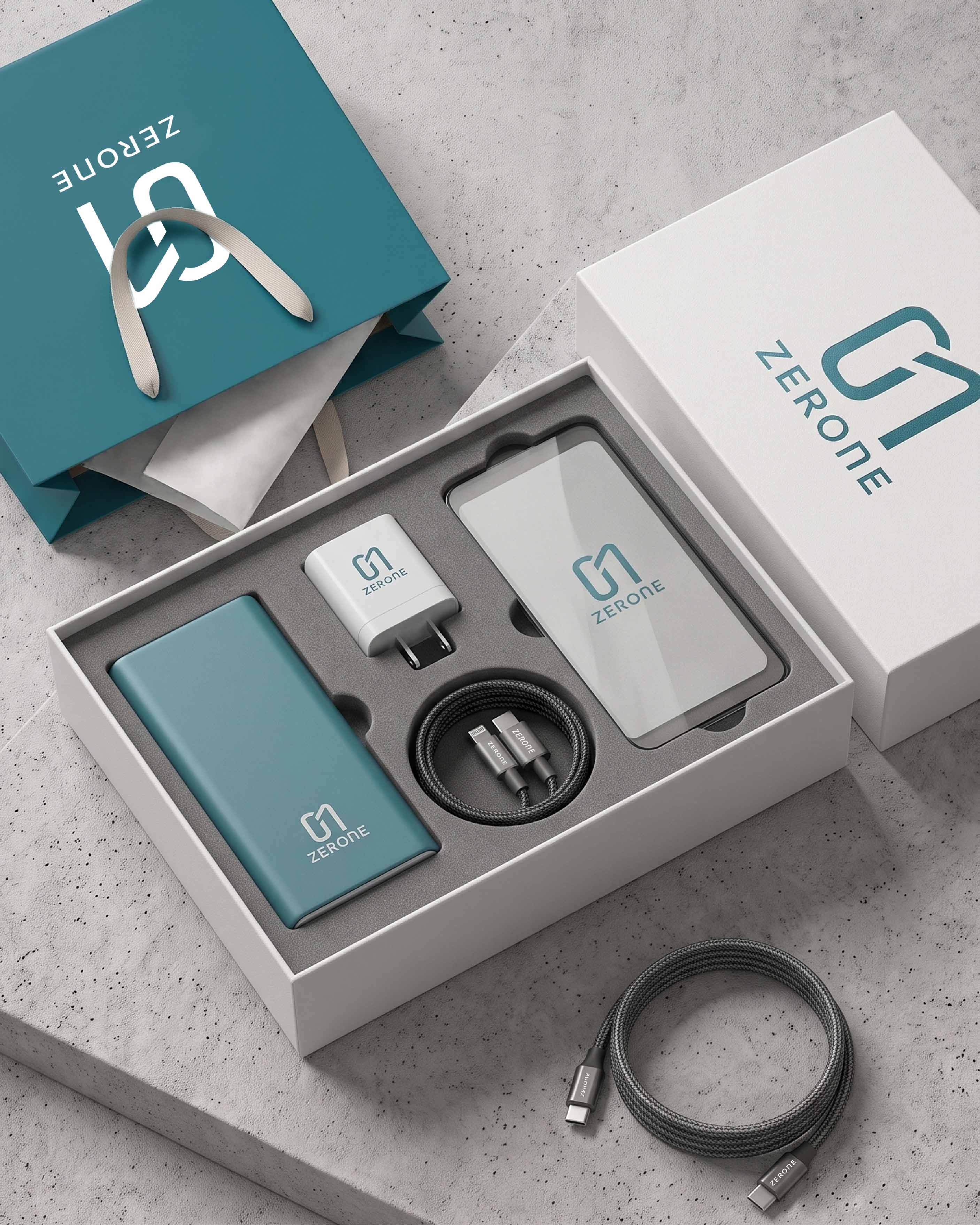
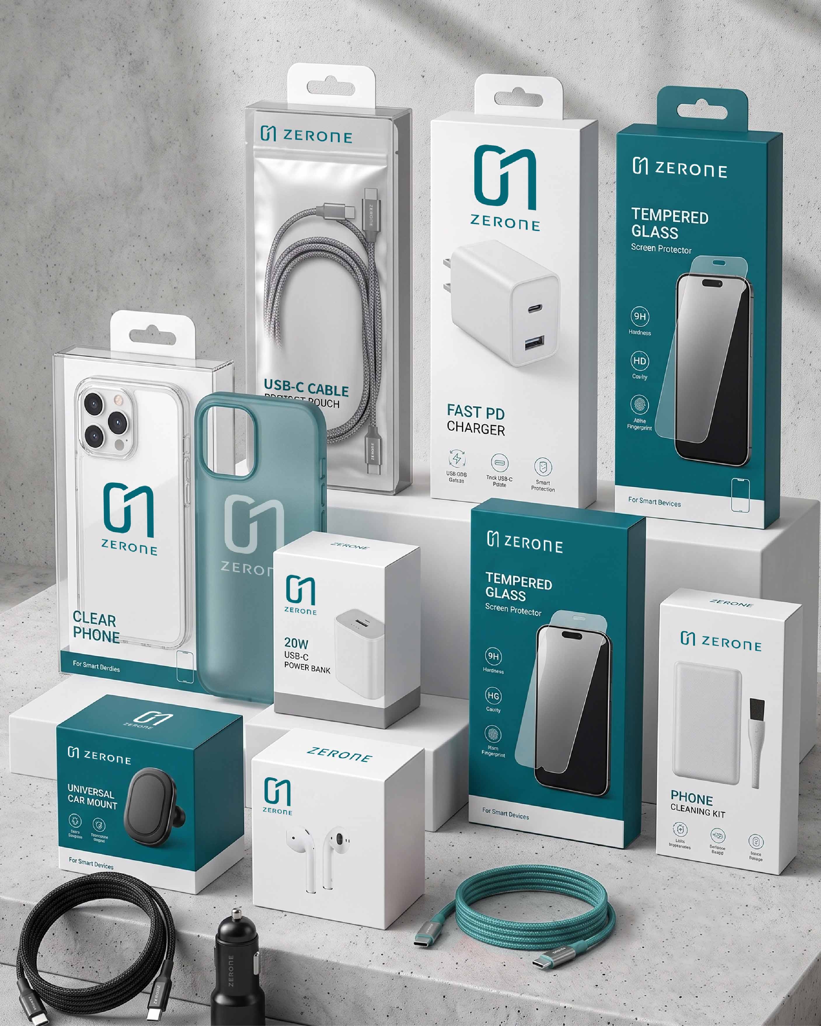
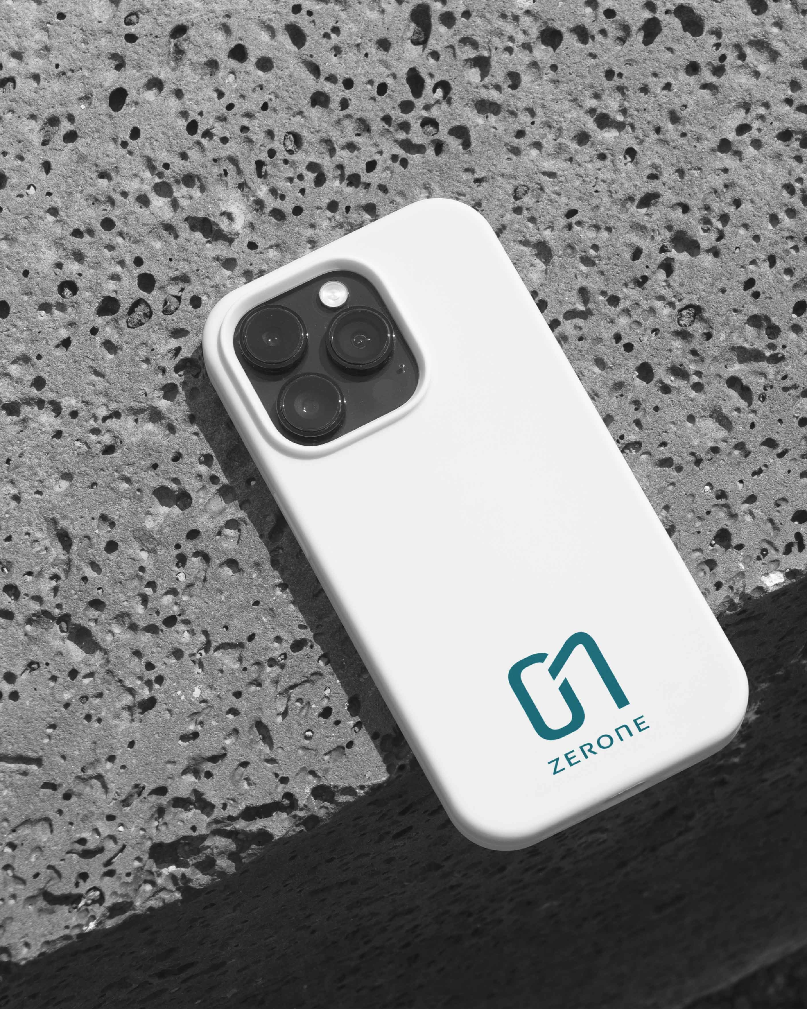
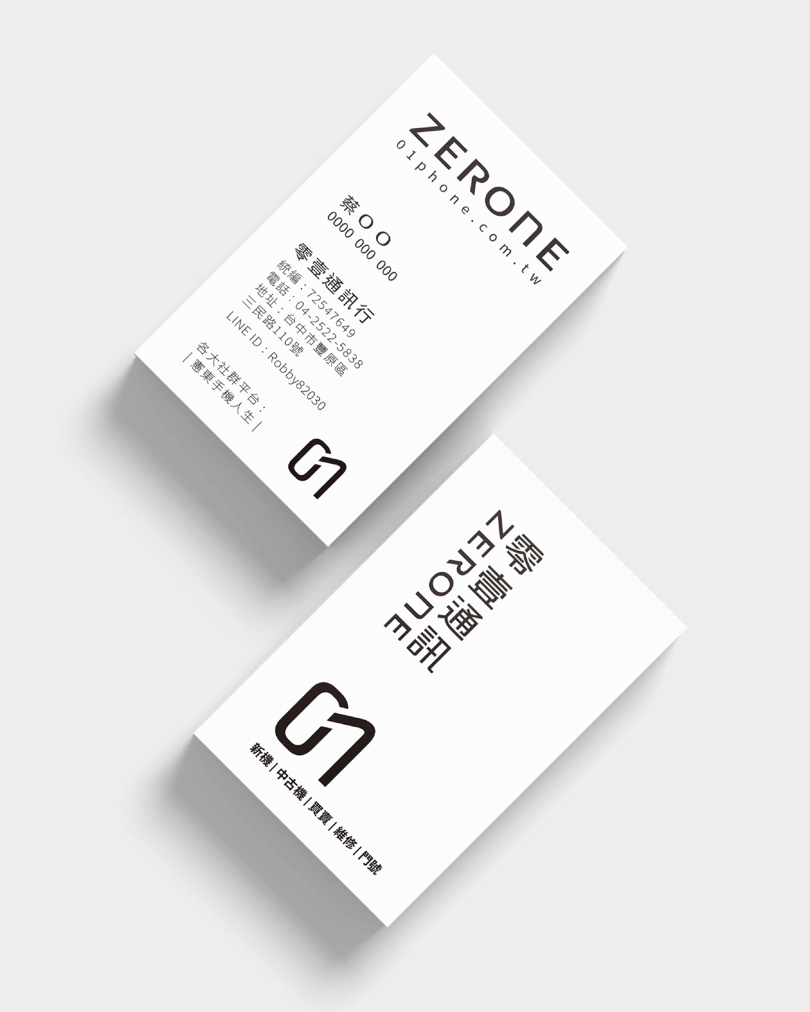
The final identity system includes the brand mark, Chinese logotype, English logotype, and visual standards for future store environments, business cards, staff ID cards, merchandise, and other brand applications. Together, these elements create a consistent system that helps reduce communication costs and supports future expansion.
We believe that design exists to reduce friction in communication.
Special thanks to our client for their trust.