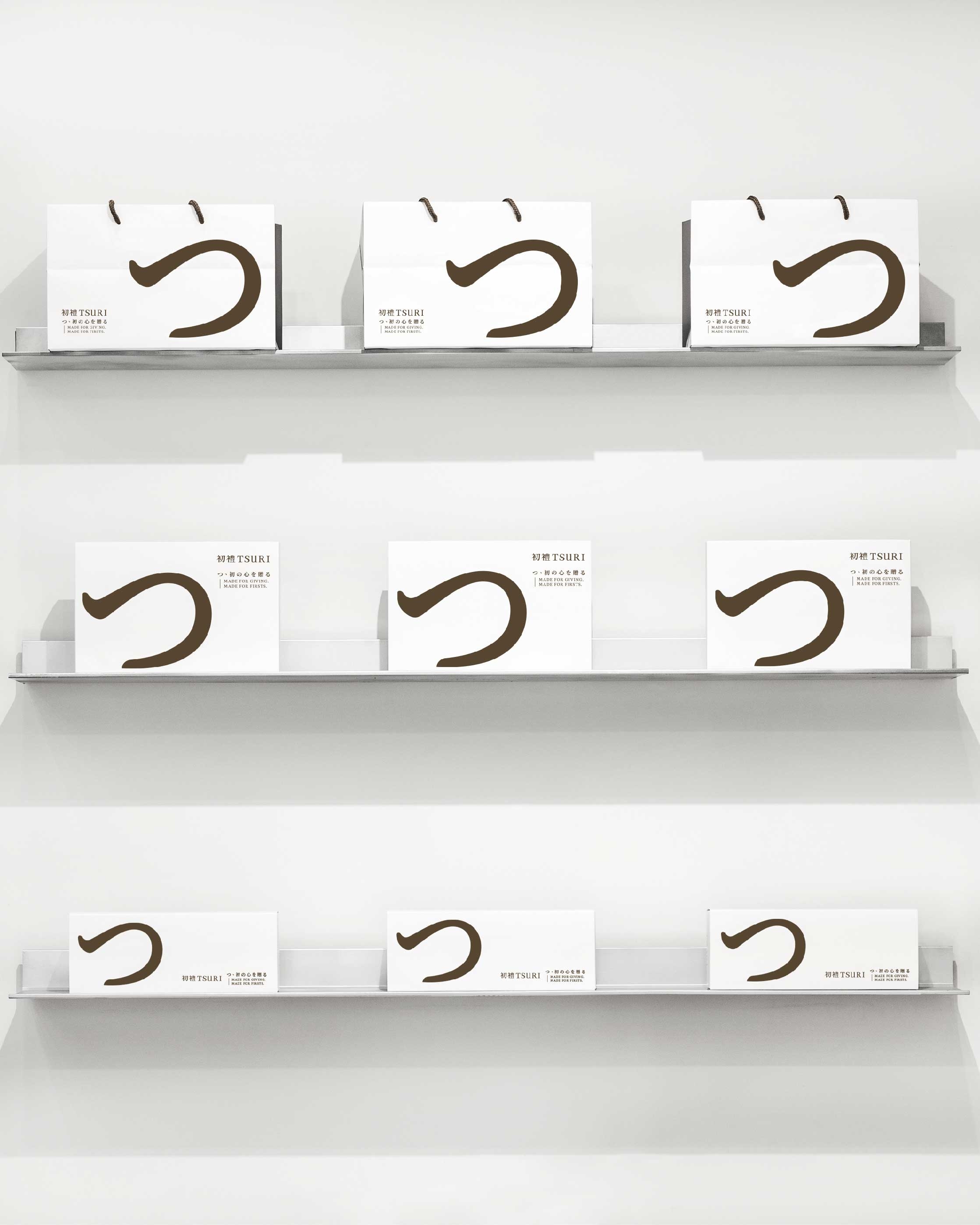
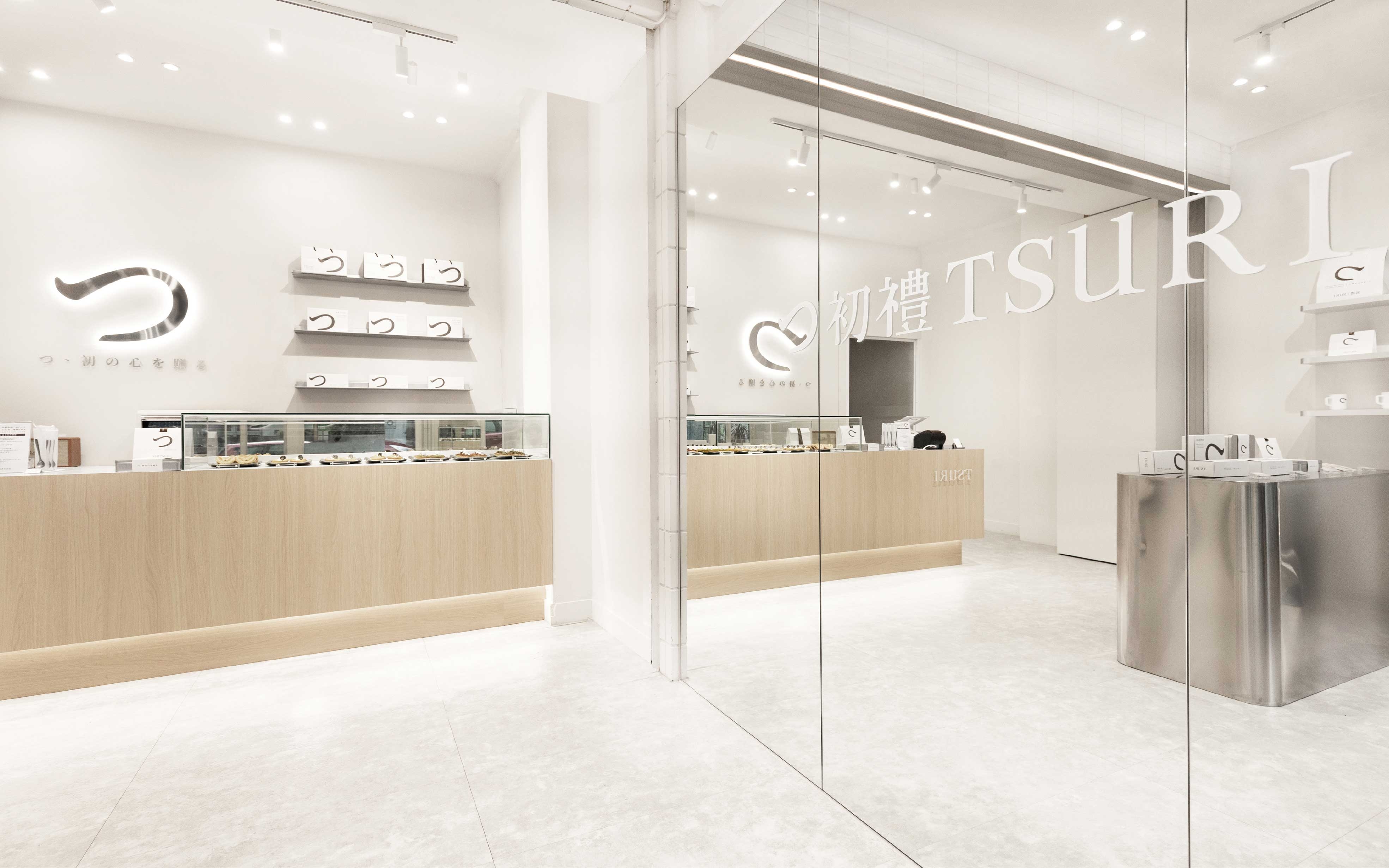
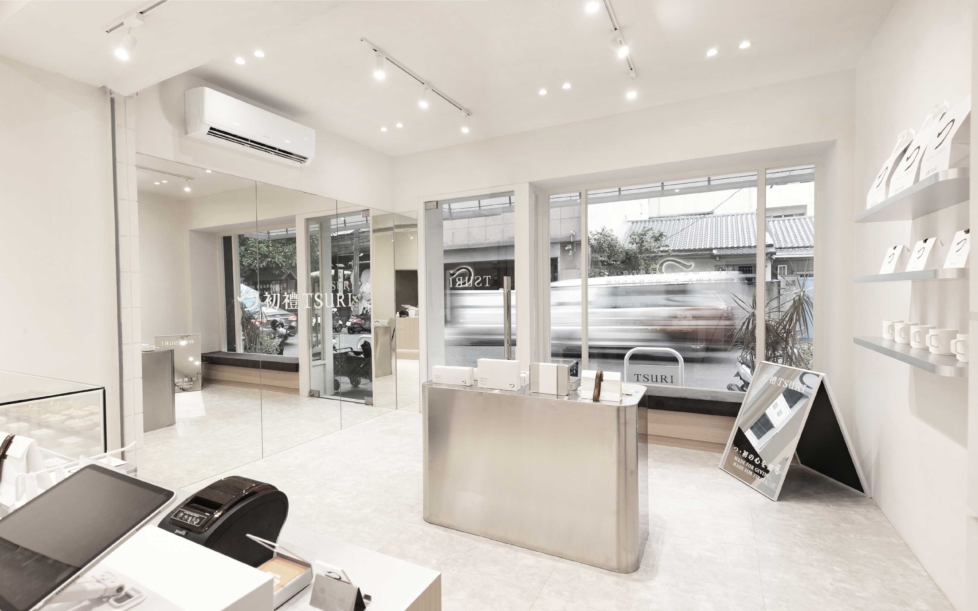
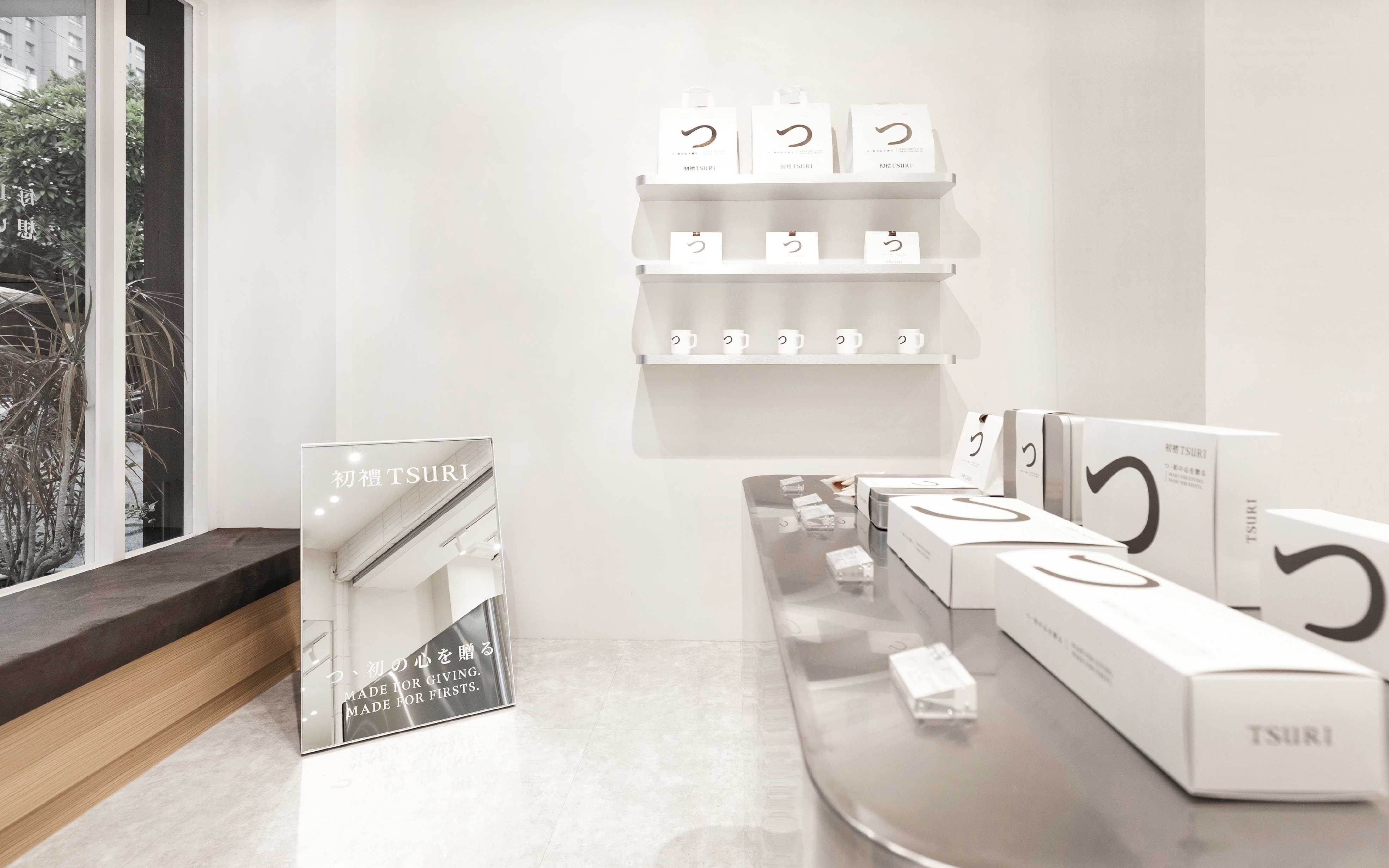
初禮 TSURI|品牌識別與整體形象規劃
送禮這件事,是從一份,
想為某個人準備些什麼的心意開始。
初禮 TSURI 的誕生,
使心意有了成形的模樣。
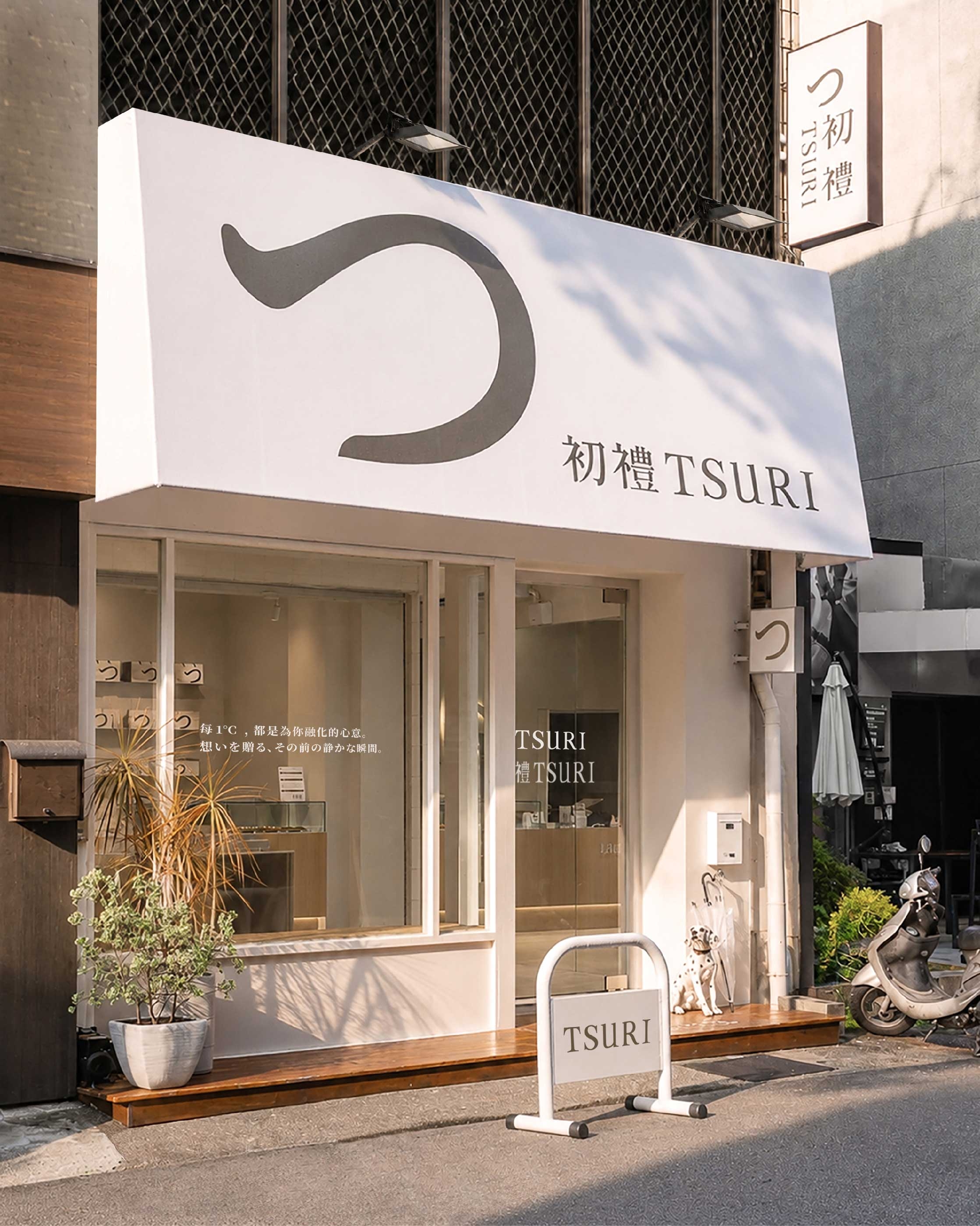
「初禮」,代表心意最初的模樣;
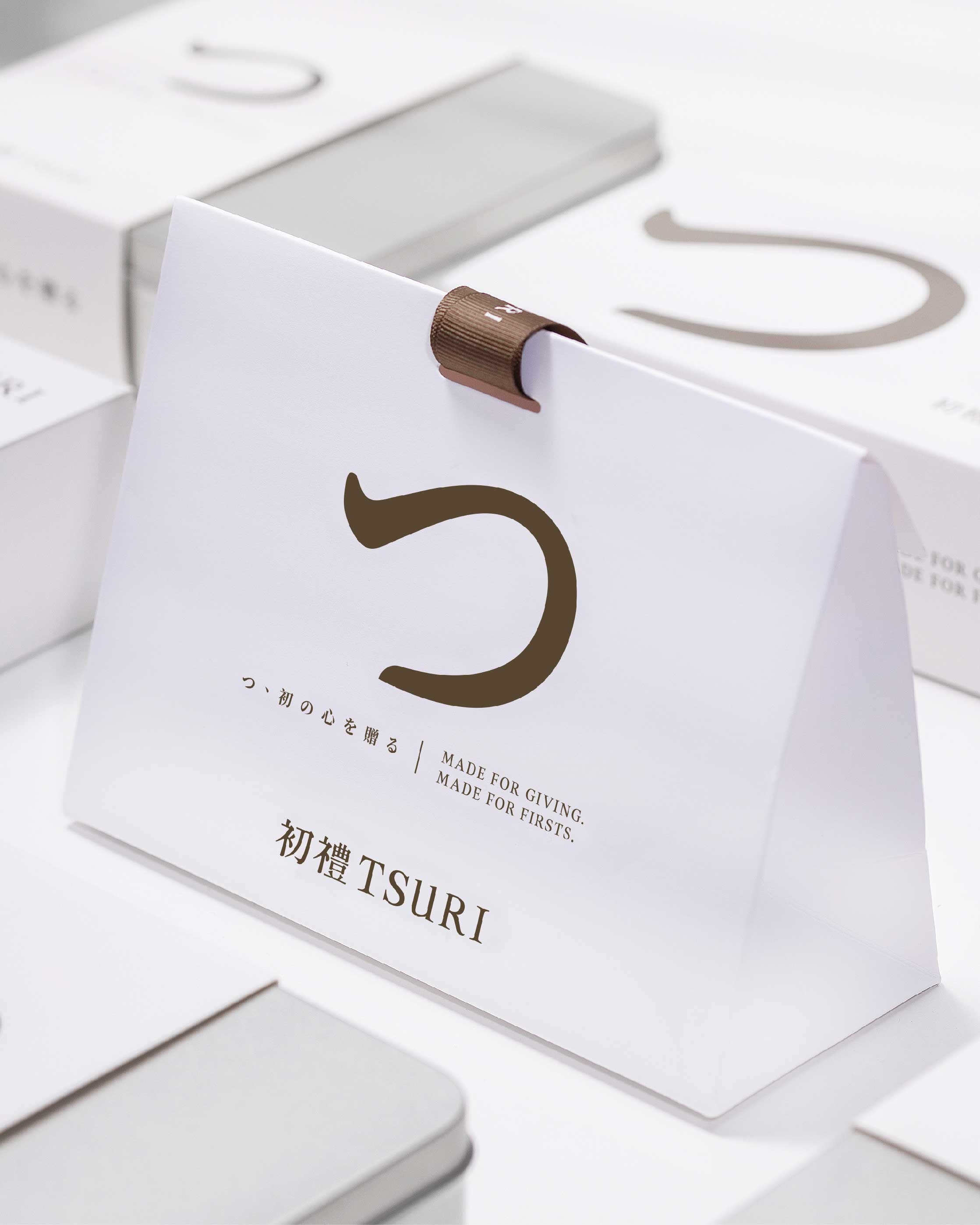
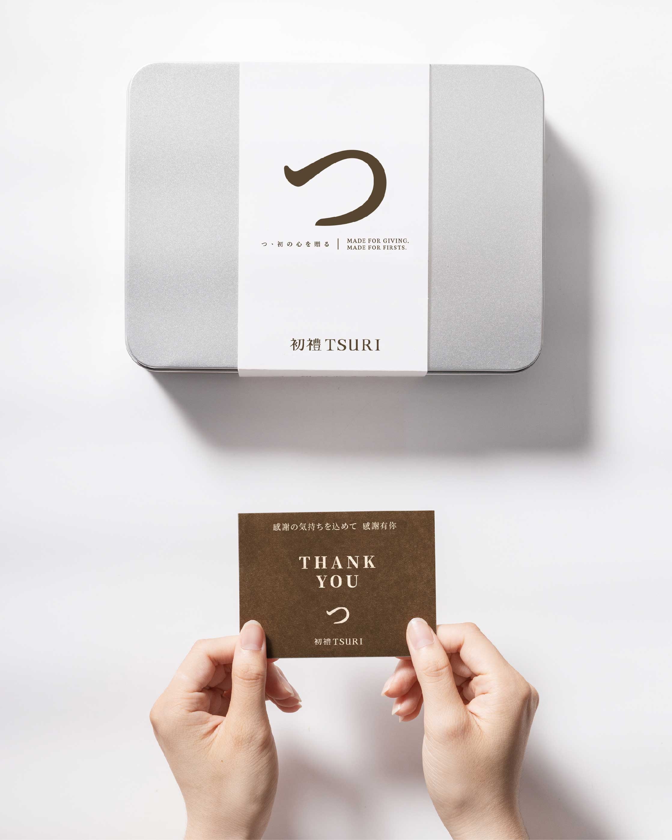
日文的「つ」,是我們為品牌設計的核心視覺符號。
一份心意成形之前,
會有一段思考、挑選,
慢慢找到答案的美好瞬間。
這是我們賦予的「留白」意義。
也是品牌核心的設計判斷,
讓滿滿的心意,
落在滿滿的留白之中。
從品牌定位、識別系統,
到包裝與門市空間的整合,
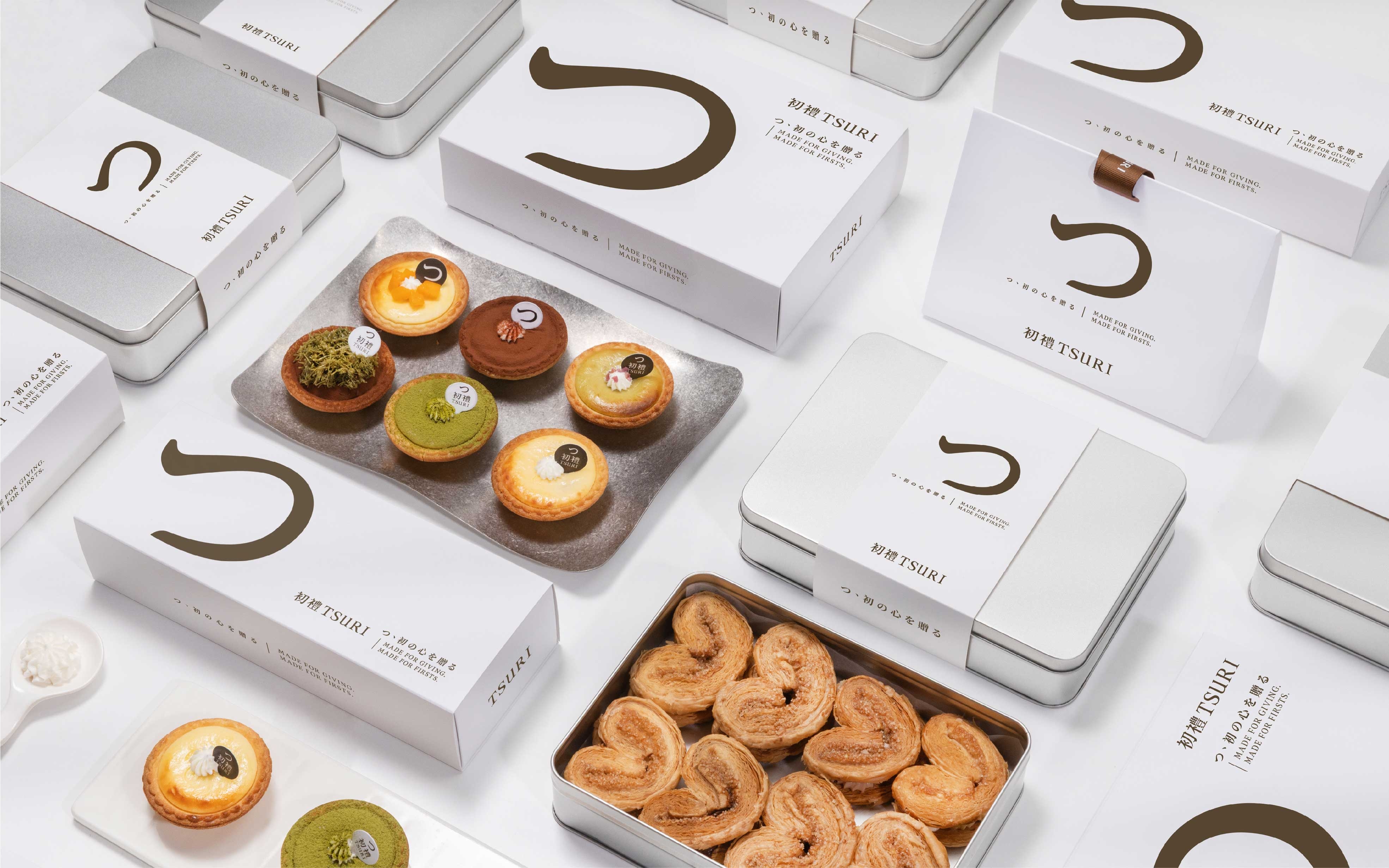
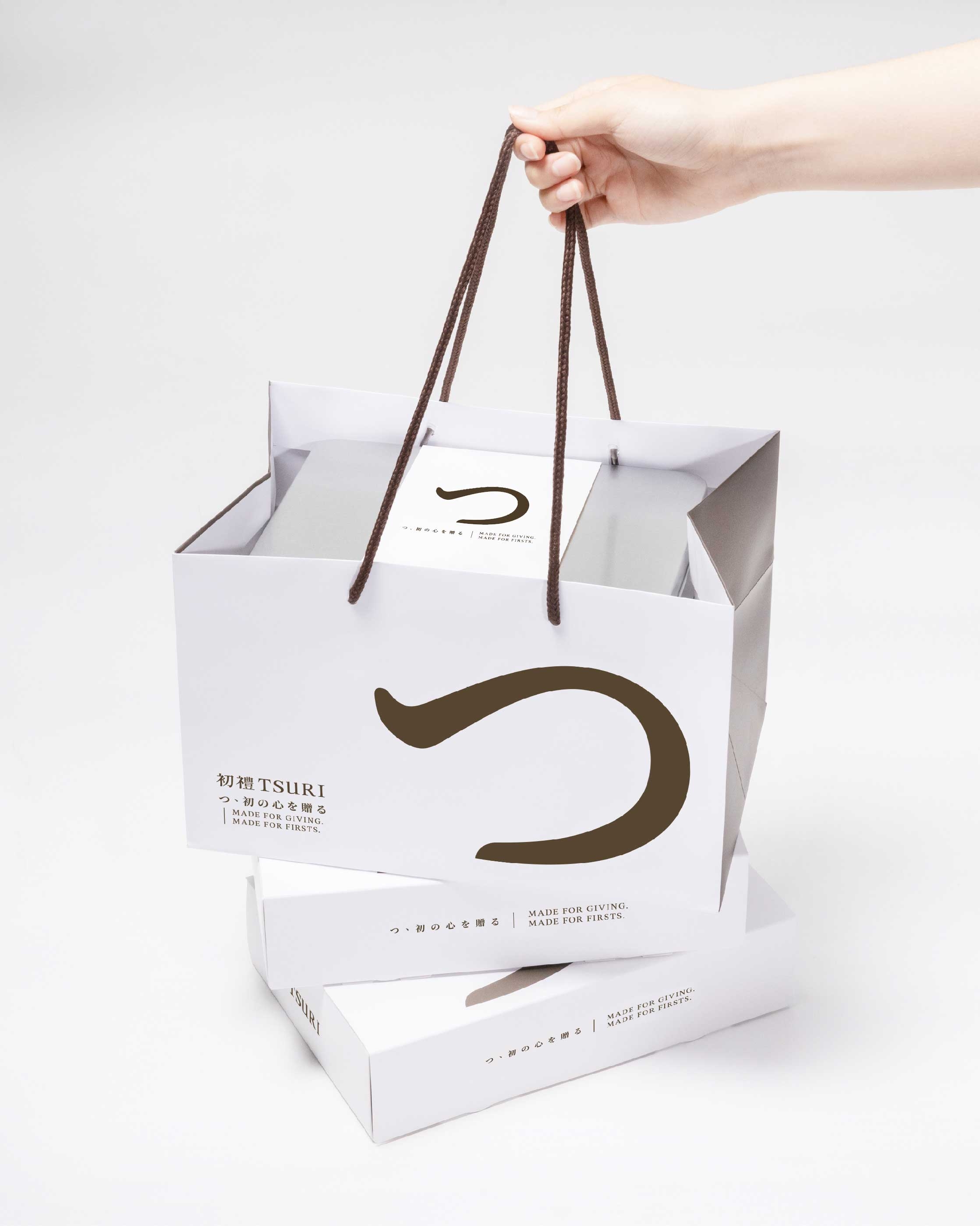
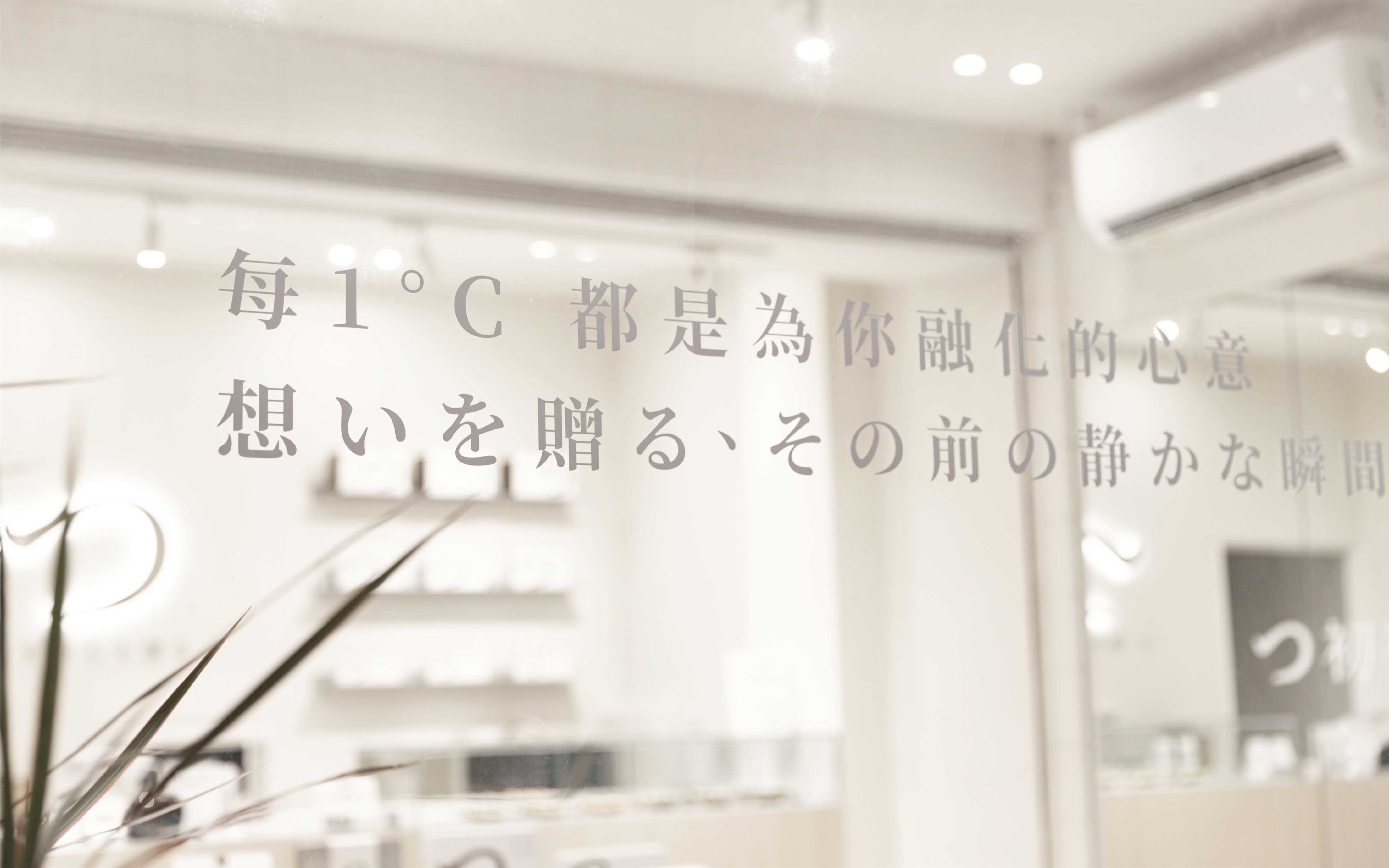
我們讓「留白」成為貫穿品牌的視覺線索。
透過字體、色彩、材質與空間的細節,
讓每一個元素彼此保有餘裕,
設計與店內手工製作的甜點,
一起成為品牌裡最重要的主角。
我們想透過這套完整的品牌系統,
讓走進初禮的人,
從原本「不知道該送什麼」,
到慢慢找到答案——
「就是這個了。」
這是你心意開始的地方,
感謝業主信任。
#品牌設計 #品牌行銷 #品牌顧問 #商業空間 #包裝設計
TSURI|Brand Identity & Visual Design
A gift begins with a thought —
something you want to prepare for someone special.
”つ“ is the core visual mark we created for the brand.
Before a thought takes shape,
there is a quiet moment to think, to choose.
We call it ”留白“ — space left intentionally.
Design steps back,
allowing the handcrafted pastries to take center stage.
From ”I don‘t know what to get,“
to — ”this is it.“
This is where a thought begins.